Chapter 2 Histograms
Do state elected officials and legislatures tend to be more liberal, moderate, or conservative? There are a lot of different measurements we could use to answer this question. Perhaps we could compare the number of Republican elected officials and the number of Democratic elected officials in each state, or maybe we could assign states ideology scores based on the percentage of the population that voted for the Republican, or Democratic presidential candidate in the last election. Today, we’re going to use NOMINATE scores. A NOMINATE score is a measure of ideology constructed from an individual legislator’s voting record, where large negative numbers indicate a very liberal legislator and large positive numbers indicate a representative who is very conservative. No matter which measurement we chose, we would need to be able to describe how the observed values of the measurement are distributed.
Distribution refers to how often a variable (in our example, legislators ideology), takes on certain values. We want to know if liberals, moderates, or conservatives are more common, and how much variation exists between scores. Statistics like the mean and SD deviation can give us some intuition for the distribution of a dataset, but reducing lots of data to one or two numbers often sacrifices too much of the detail in our variables, and can obscure some interesting features of the data. Our most fundamental tool for visualizing and understanding our data is the histogram.
2.1 Density and Bins
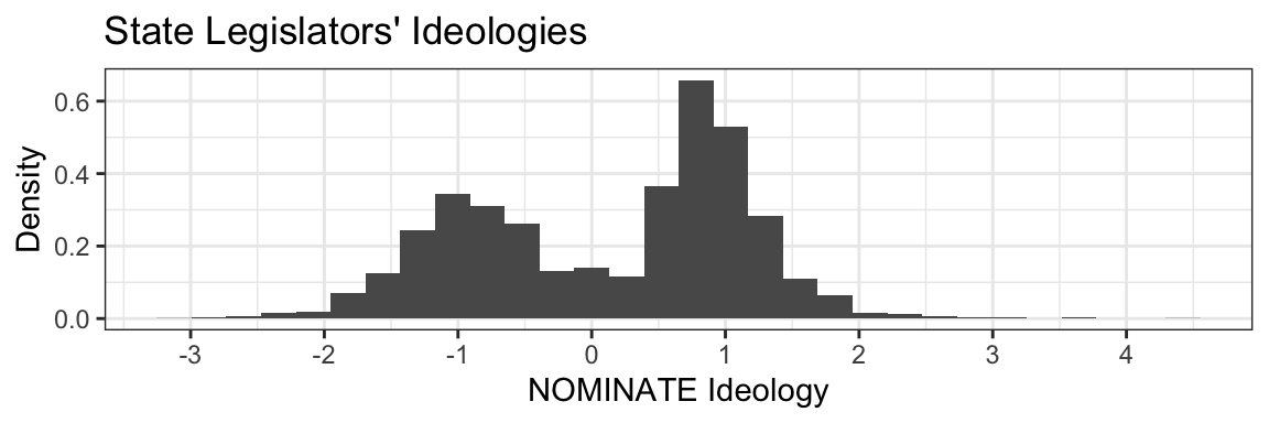
This is a histogram showing the ideologies of 5025 state legislators in all 50 states:
 This histogram shows how tightly legislators’ ideologies are packed on different ranges—bins—on a number line. The height of each bar represents the density of that bar’s bin. Taller bars indicate higher density, meaning that observations are more tightly packed in that bin, while shorter bars indicate lower density and a less full bin. Using a histogram we can see that the legislators’ ideology scores are clustered around liberal values (e.g,
 -1) and conservative values (e.g, 1), with relatively few moderates.
Exercise 2.1 Looking at the histogram:
- What (approximately) is the average ideology of state legislators?
- Are there more conservative or more liberal legislators?
- Why do you think we see lots of liberals and conservatives, but few moderates?
2.1.1 Defining Bins
Let’s take a step back from legislators for a moment to talk about bins. When drawing histograms, we must have a bin for all possible values of our quantity of interest (like ideology scores), and cannot have an observation fall into two different bins. To say which values belong in a bin we use a pair of numbers. The bin [0, 1) contains all the data falling between zero and one; [1, 2), numbers between one and two; bin [3456, 4000) contains all values between 3456 and 4000, etc.
This raises a question: what do you do if the value of an observation is exactly zero, one, 3456, or 4000? Luckily for us we can specify whether a bin is inclusive or exclusive—in other words whether the bin includes its boundary points, or if it (only) includes every number up to the boundary. We differentiate between inclusive and exclusive boundaries by using a [ or ] for inclusive boundaries and ( or ) for exclusive boundaries. Given three bins: [0, 1); [1, 2); [2, 3], 0.5 is placed in the first bin; 1.0 in the second; and 3.0 in the third. To ensure we capture all possible data, if the right side of a bin is exclusive, the left side of the next bin must be inclusive. If our three bins were [0, 1); (1, 2); (2, 3), we would potentially miss values falling on 1, 2, and 3, since none of the bins contain exactly three.
2.1.2 Calculating Density
A bin’s density is quantified as percent per unit. To find the density, we divide the percentage of observations in the bin, by the width of the bin. For example, if you have a 100 measurements (observations) of a phenomenon (variable) and the value of 20 observations falls in bin [0, 2), the bar representing those data will have a height of \[\frac{\frac{20}{100}*100\%}{2 \text{ units}} = 10\%\text{/unit}\]
For any histogram, bar height can be calculated using the formula:
\[\text{Histogram Bar Height} = \frac{\frac{\text{Num. Obs. in Bin}}{\text{Total Num. Obs.}}*100\%}{\text{Bin Width}} = \frac{\text{Percent of Observations in Bin}}{\text{Bin Width}} = \text{Percent Per Unit}\]
These calculations might look intimidating; there are a lot of steps, but each step is straightforward. After a bit of practice you’ll be surprised how well you can remember the steps and perform the calculations.
2.1.3 A Note on Bin Width
Most histograms you see will have equally sized bins, but this is not necessary. As a researcher, you are the master of your bins and they can be any size you want them to be. This power carries with it a grave responsibility; manipulating bins can be misleading if you (or your readers) aren’t reading them carefully.
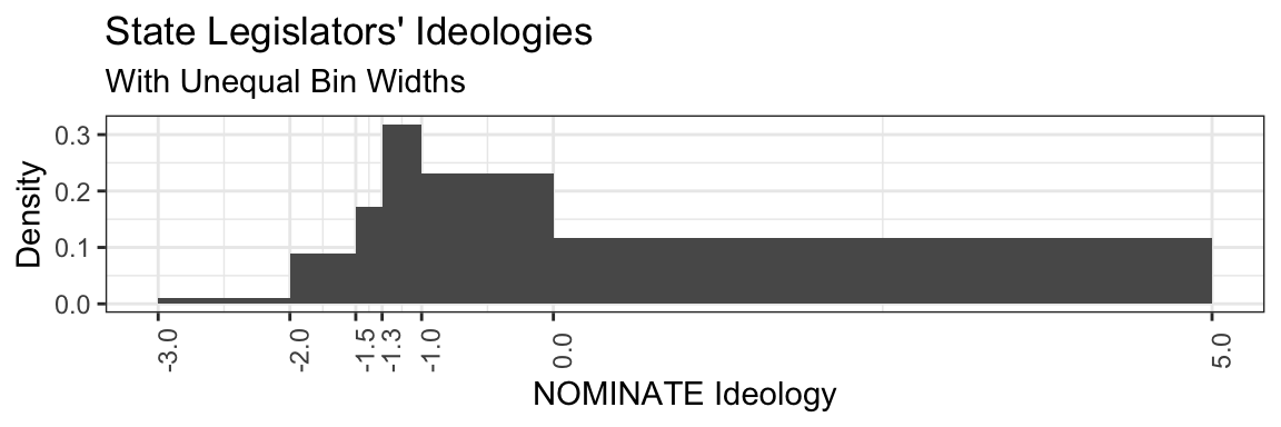
The histogram above illustrates how choosing different bins can affect the shape of your histogram; it represents exactly the same ideology data as the first example, but with unequal bin widths. Because some of our bins are very wide (e.g, [0, 5]), while others are very narrow ([-1.5, -1.3)), some interesting features of the data are obscured and the chart is generally more difficult to interpret. It’s no longer obvious that there are a distinct groupings of liberals and conservatives, rather, this presentation appears to show a large number of liberal representatives with a long tail of representatives who are either moderate or very conservative. Since our bar heights represent the percent per unit of each bin, increasing the width of the bin or decreasing the percentage of observations will each result in a shorter bar.
Because histograms visualize how denseley packed ranges (bins) along a number line are, the data you put into a histogram must be comprised of real numbers. Density is dependent on both the number of observations in the bin and the width of the bin. Categorical variables like party ID, gender identity, country of residence, preferred candidate, etc, cannot hold ranges of values, only discrete points, which have no width, and thus, no density. Further, categorical variables are not quantifiable, “Democrat” is not more or less than “Republican”, they are qualitatively different. If you’re interested in distributions in categorical variables you would likely be best suited using a bar chart to show the count or percentage of observations in each category, rather than a histogram.
As a researcher, you have a lot of discretion in choosing your bin widths, there is no firm rule or formula for how many bins you should have or what width(s) they should be. When setting your bins (or evaluating someone else’s histogram) you should always ask yourself if the data are being presented in an honest way. You should never construct your bins to obscure some important feature of your data.
2.1.3.1 Summary:
2.1.3.1.1 How to draw a Histogram:
- Determine your bins. Sometimes these will be given to you, and sometimes you will come up with them yourself.
- Draw a number line, and mark off your bins along the line.
- Now for the fun part—math! Find the percentage of observations that fall into each bin (consult the formula above if need be).
- Divide that percentage by the width of the bin, now you know the density!
- Now that you have done your calculations you can plot out the heights of the bars using the values you calculated above.
Exercise 2.2 You now have all the tools you need to draw a histogram! In the chapter above, we visualized the ideologies of legislators. Below, we have presented a table of the average ideology of all 50 state legislatures. In other words, our first few histograms visualized the observed ideologies of individual elected officials, while the data below are the mean ideologies of each state. Use these data and the bins provided below to draw a histogram, then answer the following questions:
- Approximately what is the average, average state legislature ideology (no need to calculate it by hand, estimate using the histogram)?
- Do legislatures tend to be more conservative, or more liberal?
- Do you notice anything unusual about the data? We have not talked much about what you should expect, so if the answer is “no”, that is okay.
- How does your histogram compare to the first histogram of the ideologies of individual legislators? If there are meaningul differences between the two, what are some possible political implications of these differences?
- Redraw the histogram with bins of your own choosing. Has the distribution of the data changed?
- Write a few sentences on the differences between density and distribution. Which one is a feature of your histogram, and which is a feature of your data?
Data:
| 0.32 | -0.04 | 0.70 | -0.97 | 0.57 |
| 0.46 | 0.68 | 0.33 | 0.38 | 0.18 |
| 0.77 | -0.37 | 0.21 | 0.86 | -0.15 |
| 0.08 | 0.51 | 0.29 | -0.31 | 0.04 |
| -0.54 | 0.41 | 0.48 | 0.10 | 0.43 |
| 0.05 | 0.29 | 0.59 | -0.44 | 0.31 |
| -0.60 | -0.45 | 0.13 | 0.43 | 0.32 |
| -0.38 | -0.21 | -0.60 | 0.54 | 0.46 |
| 0.11 | -0.01 | -0.11 | 0.58 | 0.77 |
| 0.42 | 0.00 | 0.24 | 0.55 | 0.08 |
Bins:
[-1.0, -0.7)
[-0.7, -0.1)
[-.1, 0.1)
[0.1, 0.5)
[0.5, 1.0]
2.2 Visualizing Data
Histograms serve as a remarkably useful tool for understanding the distribution of a single variable in a dataset displaying the density of the data. Rather than reducing an entire set of values down to one or two conceptually opaque numbers (e.g. mean and standard deviation), histograms show you and your readers the data.
| sample | Mean | SD |
|---|---|---|
| 1 | -0.12 | 2.80 |
| 2 | 0.42 | 2.59 |
| 3 | 0.10 | 2.85 |
| 4 | -0.22 | 2.14 |
Consider the table above. It reports the mean and standard deviation of four different randomly generated variables. The mean and SD of each variable are fairly similar, so it seems reasonable to assume the data are pretty similar as well. Let’s check by plotting them out in histograms:
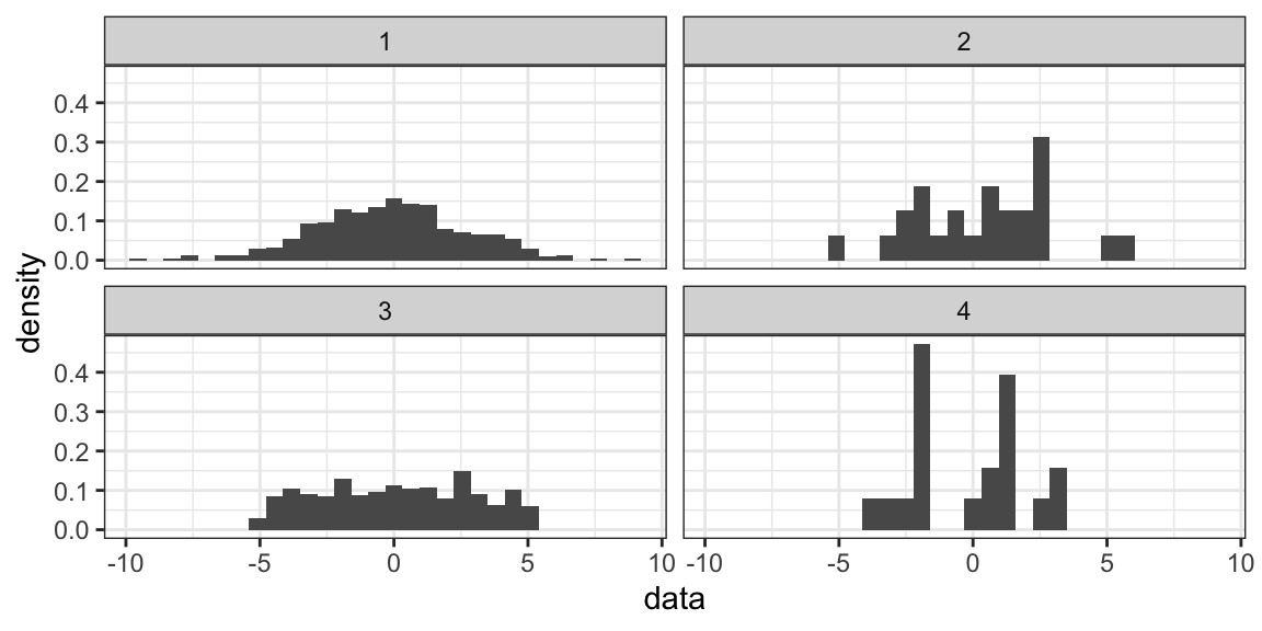
Huh. There are pretty clear differences between them that are lost just in looking at descriptive statistics. Putting your data into a histogram can also be usefulto quickly check for unexpected values. If you expect your data to range from [0, 10], but you put it in a histogram and find a high density bin from [-9, -8) you will know something has gone awry with your data that you should go back and check before proceeding with your analysis.